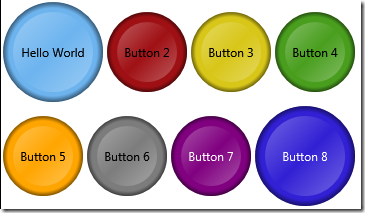
Here’s another WPF button template, since my first one continues to be one of the most popular posts on my blog. This one is in response to a question about how the button could be made circular. The basic background of the button is formed by superimposing three circles on top of each other:
<Grid Width="100" Height="100" Margin="5">
   <Ellipse Fill="#FF6DB4EF"/>
   <Ellipse>
      <Ellipse.Fill>
         <RadialGradientBrush>
            <GradientStop Offset="0" Color="#00000000"/>
            <GradientStop Offset="0.88" Color="#00000000"/>
            <GradientStop Offset="1" Color="#80000000"/>
         </RadialGradientBrush>
      </Ellipse.Fill>
   </Ellipse>
   <Ellipse Margin="10">
      <Ellipse.Fill>
         <LinearGradientBrush>
            <GradientStop Offset="0" Color="#50FFFFFF"/>
            <GradientStop Offset="0.5" Color="#00FFFFFF"/>
            <GradientStop Offset="1" Color="#50FFFFFF"/>
         </LinearGradientBrush>
      </Ellipse.Fill>
   </Ellipse>
</Grid>
Here’s what that looks like:
Now to turn it into a template, we follow a very similar process to before. We allow the Background colour to be overriden by the user if required. I couldn’t come up with a neat way of forcing the button to be circular, but it is not too much of a chore to set the Height and Width in XAML.
The focus rectangle has been made circular. For the IsPressed effect, I simply change the angle of the linear gradient of the inner circle a little, and move the ContentPresenter down a bit, which seems to work OK. I haven’t created any triggers yet for IsMouseOver, IsEnabled or IsFocused, mainly because I’m not quite sure what would create a the right visual effect.
<Page.Resources>
  <Style x:Key="MyFocusVisual">
     <Setter Property="Control.Template">
        <Setter.Value>
           <ControlTemplate TargetType="{x:Type Control}">
              <Grid Margin="8">
                 <Ellipse
                    Name="r1"
                    Stroke="Black"
                    StrokeDashArray="2 2"
                    StrokeThickness="1"/>
                 <Border
                    Name="border"
                    Width="{TemplateBinding ActualWidth}"
                    Height="{TemplateBinding ActualHeight}"
                    BorderThickness="1"
                    CornerRadius="2"/>
              </Grid>
           </ControlTemplate>
        </Setter.Value>
     </Setter>
  </Style>
  <Style x:Key="CircleButton" TargetType="Button">
     <Setter Property="OverridesDefaultStyle" Value="True"/>
     <Setter Property="Margin" Value="2"/>
     <Setter Property="FocusVisualStyle" Value="{StaticResource MyFocusVisual}"/>
     <Setter Property="Background" Value="#FF6DB4EF"/>
     <Setter Property="Template">
        <Setter.Value>
           <ControlTemplate TargetType="Button">
              <Grid>
                 <Ellipse Fill="{TemplateBinding Background}"/>
                 <Ellipse>
                    <Ellipse.Fill>
                       <RadialGradientBrush>
                          <GradientStop Offset="0" Color="#00000000"/>
                          <GradientStop Offset="0.88" Color="#00000000"/>
                          <GradientStop Offset="1" Color="#80000000"/>
                       </RadialGradientBrush>
                    </Ellipse.Fill>
                 </Ellipse>
                 <Ellipse Margin="10" x:Name="highlightCircle" >
                    <Ellipse.Fill >
                       <LinearGradientBrush >
                          <GradientStop Offset="0" Color="#50FFFFFF"/>
                          <GradientStop Offset="0.5" Color="#00FFFFFF"/>
                          <GradientStop Offset="1" Color="#50FFFFFF"/>
                       </LinearGradientBrush>
                    </Ellipse.Fill>
                 </Ellipse>
                 <ContentPresenter x:Name="content" HorizontalAlignment="Center" VerticalAlignment="Center"/>
              </Grid>
              <ControlTemplate.Triggers>
                 <Trigger Property="IsPressed" Value="True">
                    <Setter TargetName="highlightCircle" Property="Fill">
                       <Setter.Value>
                       <LinearGradientBrush StartPoint="0.3,0" EndPoint="0.7,1">
                          <GradientStop Offset="0" Color="#50FFFFFF"/>
                          <GradientStop Offset="0.5" Color="#00FFFFFF"/>
                          <GradientStop Offset="1" Color="#50FFFFFF"/>
                       </LinearGradientBrush>
                       </Setter.Value>
                    </Setter>
                    <Setter TargetName="content" Property="RenderTransform">
                       <Setter.Value>
                          <TranslateTransform Y="0.5" X="0.5"/>
                       </Setter.Value>
                    </Setter>
                 </Trigger>
              </ControlTemplate.Triggers>
           </ControlTemplate>
        </Setter.Value>
     </Setter>
  </Style>
</Page.Resources>
Here’s how we declare a few of these buttons of different sizes, and with different background colours:
<WrapPanel>
  <Button Width="100" Height="100" Style="{StaticResource CircleButton}">Hello World</Button>
  <Button Width="80" Height="80" Style="{StaticResource CircleButton}" Background="#FF9F1014">Button 2</Button>
  <Button Width="80" Height="80" Style="{StaticResource CircleButton}" Background="#FFD8C618">Button 3</Button>
  <Button Width="80" Height="80" Style="{StaticResource CircleButton}" Background="#FF499E1E">Button 4</Button>
  <Button Width="80" Height="80" Style="{StaticResource CircleButton}" Background="Orange">Button 5</Button>
  <Button Width="80" Height="80" Style="{StaticResource CircleButton}" Background="#FF7C7C7C">Button 6</Button>
  <Button Width="80" Height="80" Style="{StaticResource CircleButton}" Background="Purple" Foreground="White">Button 7</Button>
  <Button Width="100" Height="100" Style="{StaticResource CircleButton}" Background="#FF3120D4" Foreground="White">Button 8</Button>
</WrapPanel>
Sadly, the use of ControlTemplate triggers means that this template can’t be used directly in Silverlight. I’ll maybe look into converting them to VisualStates for a future blog post.


8 comments:
Hello Mark,
awesome work!
Please continue to put out this kind of stuff on your blog!
Why can't i move the Buttons around? o.O
How do I copy the code off your blog without getting all the line numbers?
How do I copy the code off your blog without the line numbers?
@Kevin - double-click in the code area - it will select the text without the line numbers.
how to wrap the button text
Hi, I am getting this message:
The attached property 'Page.Resources' is not defined on or one of its base classes.
Can you help me, please?
Having switched to WPF end of last year, on the one hand it's scary how much I have to learn (though that's what makes it fun too), on the other I am continually grateful for contributions to 'the community' (if that doesn't sound too pompous?!) such as this. Much obliged :)
Post a Comment